Visualizations created using various different tools
Vega-Lite
Vega-Lite is a high-level grammar of interactive graphics. It provides a concise, declarative JSON syntax to create an expressive range of visualizations for data analysis and presentation.I've used Vega-Lite inside PowerBI to create custom visuals as needed.
ARR Snowball
A useful tool to see how well (or poorly) you're retaining and growing your customer base.

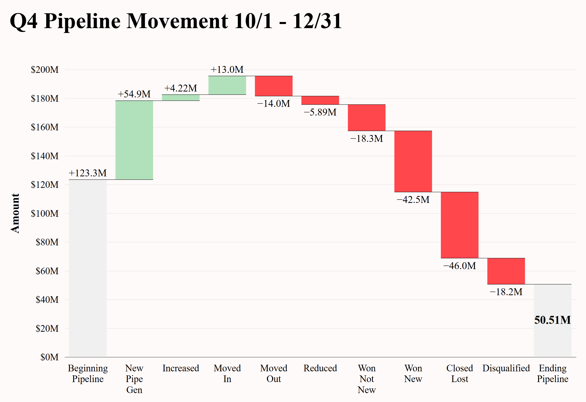
Pipeline Waterfall
Analyze how your pipeline changes over time to uncover trends and insights and help improve forecasting.
Python
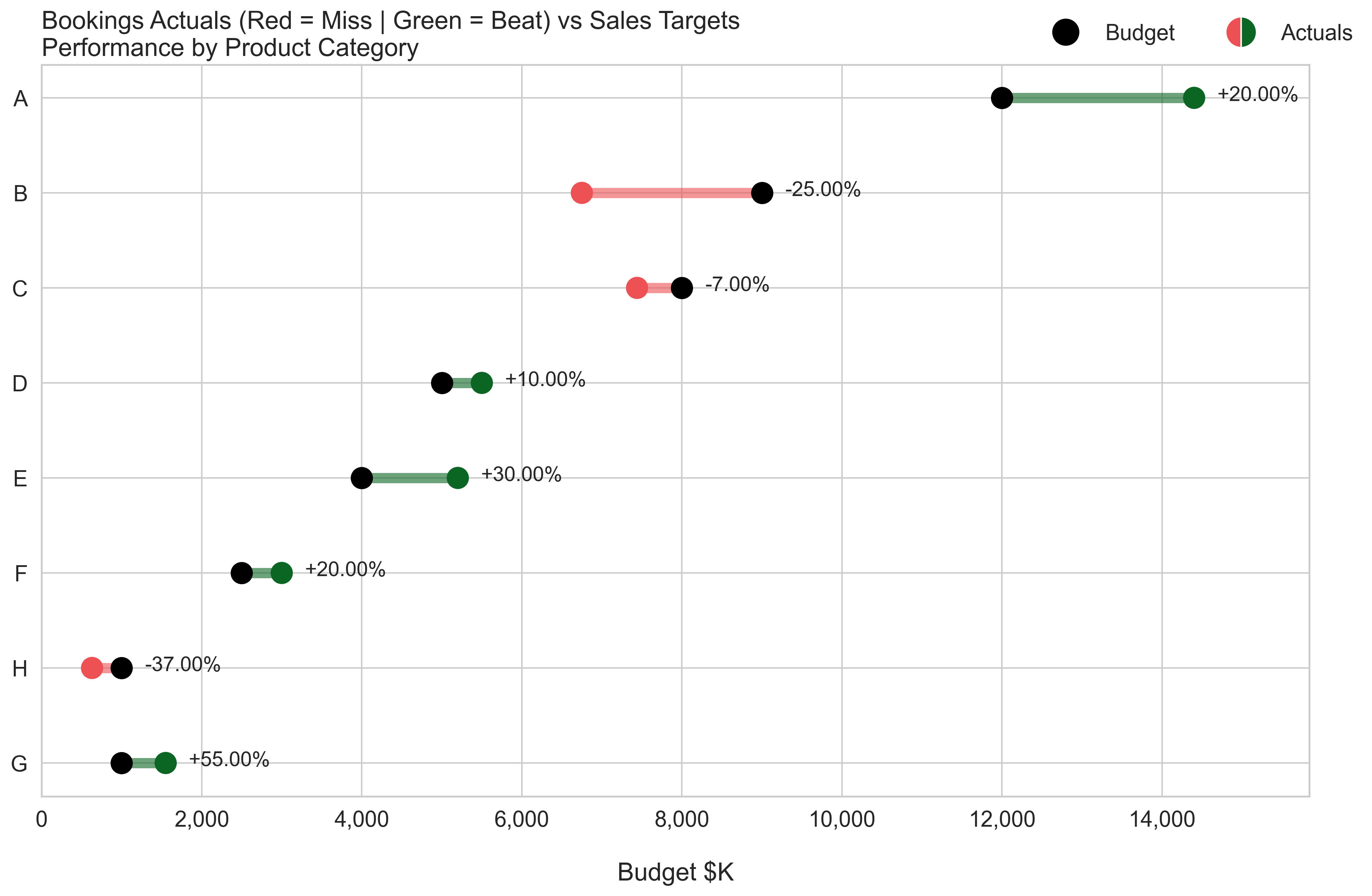
seaborn is a Python data visualization library based on matplotlib. It provides a high-level interface for drawing attractive and informative statistical graphics.Actual vs Budget Comparison
This visual quickly displays attainment to targets, clearly highlighting over and underperformers, along with their magnitude.
Plotly is a neat library to create animated and interactive visuals.
Click a link to see them in action.